Pre-requisites:
- Setup
- Basics Overview
- Vector
Objectives:
- Understand raster data formats, scale, resolution
- Recognize a few spatial raster formats
- Insepect and understand raster data in QGIS
Exercise: Introduction to raster data in QGIS
Raster
 ref: [^1]
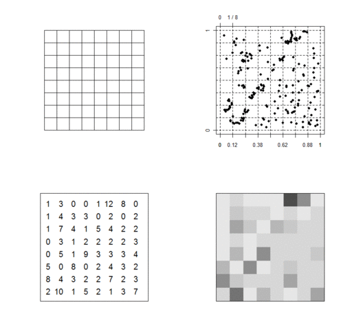
- Raster image
- A dot matrix data structure representing a generally rectangular grid of pixels, or points of color, viewable via a monitor, paper of other display medium.[^1]
Raster data is used to represent continuous phenemena in our world. Continuous phenomena have an assigned value at all positions on a surface. Raster data is commonly seen in satellite images. Satellite images are, simply put, pictures of the earth from space. Just like the pictures you can take with a hand-held digital camera, the information is in the pixels. Each pixel has a number value that can be translated into a color. Raster data is commonly output by sensors.
 ref: [^2]
Common Data Formats
Here are some common data formats you may encounter:
- GeoTIFF: A standard that allows embedding geographic information in a TIFF file.
- NetCDF: A multidimensional data format that allows for multiple variables covering 1 or more dimensions.
- Arcinfo/Ascii grid: Proprietary format by Esri
- JPEG: A compressed image format that can be assigned bounding coordinates.
Scale
- Scale
- Proportional difference between representation and actual object.
Scale bars are commonly used on maps to visualize the map distance in real world units.
Scales can also be expressed in words (lexical form) or in a ratio (representative fraction).
Lexical Form
- “five meters per centimeter”
- “120 miles per inch”
Representative Fraction
- 1:500,000
- 1:25,000
Resolution
Types:
- Spatial Resolution
- Number of pixels per unit (pixels per inch)
- Temporal Resolution
- Number of frames per time interval (20 frames per second)
- Spectral Resolution
- Range of light wavelengths that can be captured by a given sensor (number of light bands)
- Radiometric Resolution
- Number of differences in brightness that can be detected (number of shades) —-
Exercise
This exercise will introduce visualizing raster data in QGIS with common and simple procedures.
- Import raster data
- Open QGIS and load the Oregon GTOPO30 DEM through iRods access:
/iplant/home/shared/aegis/Spatial-bootcamp/basics/raster/gt30w140n90_oregon.tif
Or download here and Add Raster Layer :
:
gt30w140n90_oregon.tif.
Your workspace should look like the image below.
We're viewing a Digital Elevation Model (DEM). This represents the elevation of the given area. This GeoTIFF assigns the elevation to its cells, or pixels. So, we're actually visualizing cells with their associated values (elevation).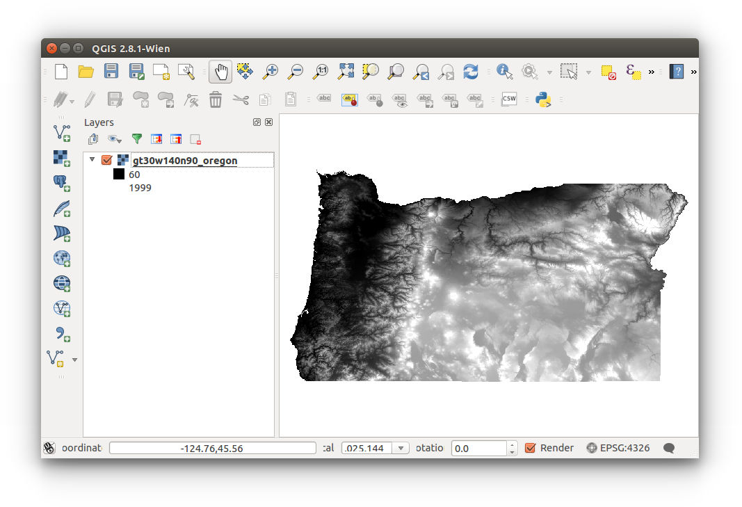
- Open QGIS and load the Oregon GTOPO30 DEM through iRods access:
- Raster histogram
- Open the raster histogram: Right-click layer (layer list) > Properties > Histogram
The histogram is a graphical representation of the raster value data.
Close the Layer Properties once you're finished viewing the histogram.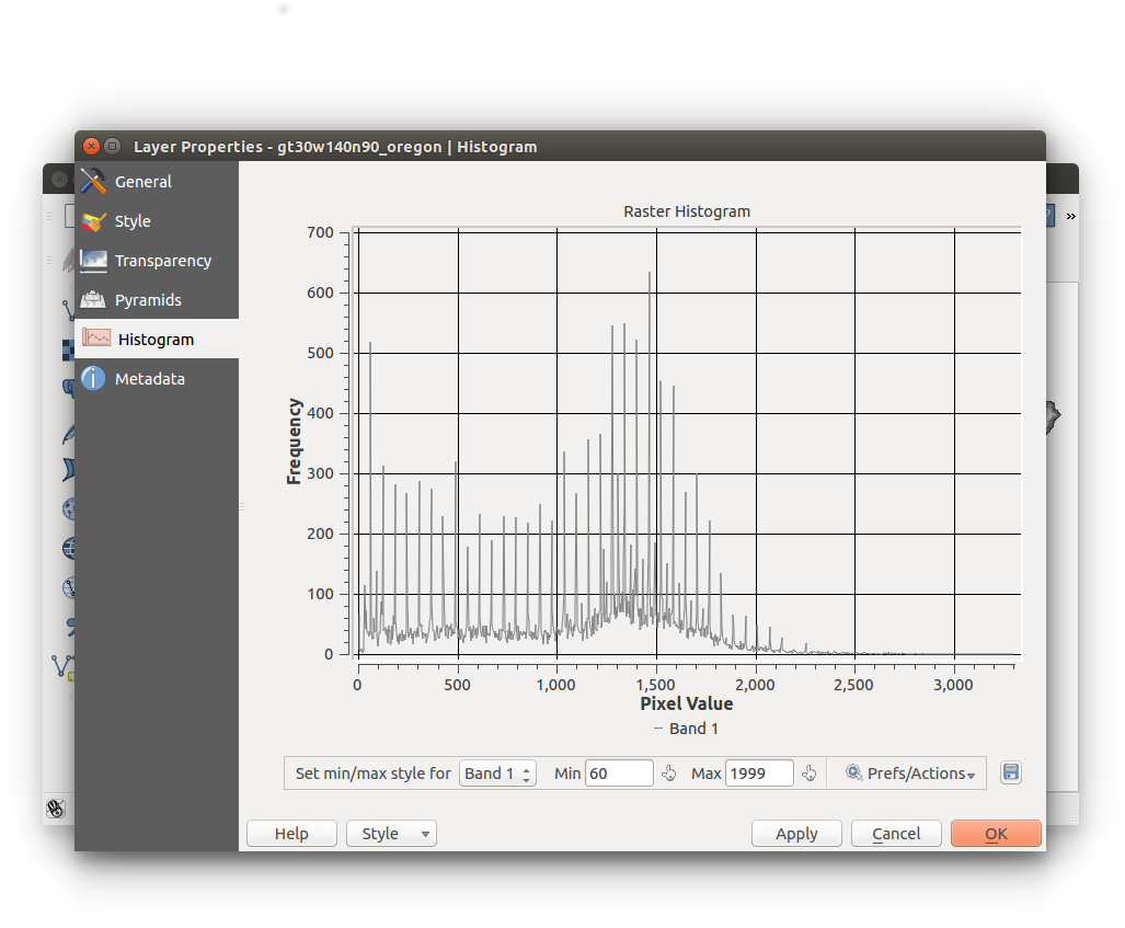
- Open the raster histogram: Right-click layer (layer list) > Properties > Histogram
- Resolution
- Zoom in close enough to see the actual pixels of the raster.
Do you see a difference between a raster and a vector?
Remember, vector data are points, or points connected by lines, while raster data are stored in cells or arrays.
You can use the Identify Features tool to click on data visualized on the map canvas to view its attributes.
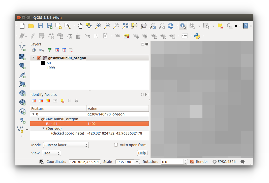
- Zoom in close enough to see the actual pixels of the raster.
- Style
Styling data is the fun part. Sometimes it's good practice to add color to your data to better understand and visualize.
- Open the raster Properties: Right-click layer (layer list) > Proper > Style
Configure your settings as follow, within the Band Rendering section:- Render type: Singleband pseudocolor
- Load actual min/max values:
- Load min/max values: Min/Max
- Accuracy: Actual (slower)
- Click LOAD
- Generate new color map: (select color, invert if necessary)
- Click CLASSIFY
- Click APPLY and OK to save changed and return to the map
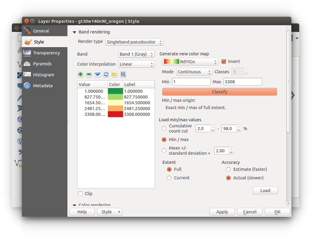
You should now be visualizing your DEM with color.
Keep in mind, the legend below (displayed below the layer name in the layer list) reads: values 1 to 827.74 = green, 827.75 to 1654.49 = light green, and so on. Highest points (cells) of elevation are viualized in red.
Changing the number of classifications, or increasing the number of range of values will visualize the raster differently.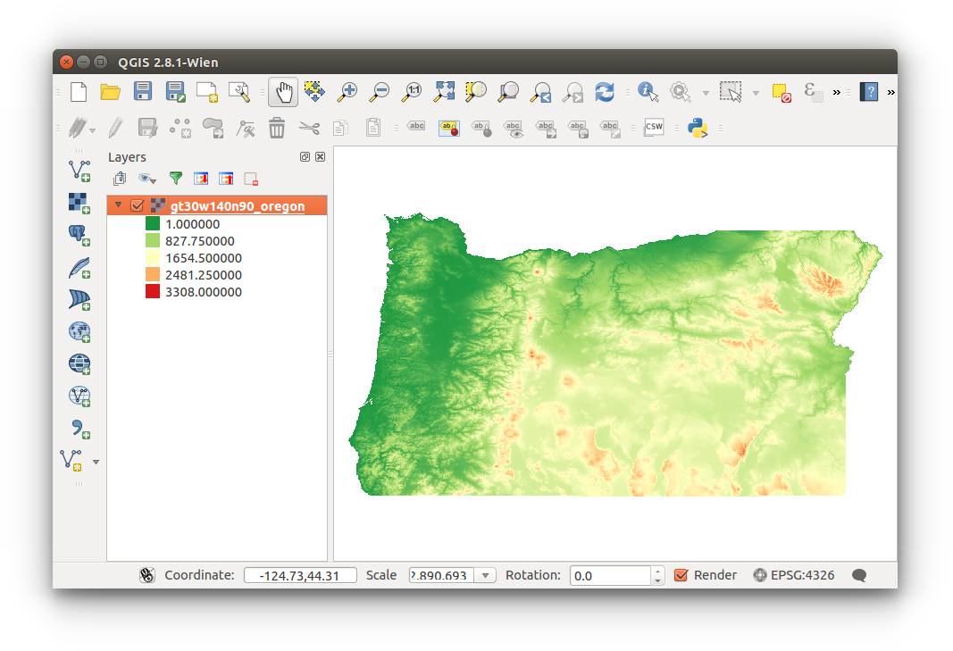
You've now been introduced to raster data and styling in QGIS.
You do not need to save this project.
- Open the raster Properties: Right-click layer (layer list) > Proper > Style
- By Gringer (Own work) [CC0], via Wikimedia Commons" href="http://commons.wikimedia.org/wiki/File%3ARgb-raster-image.svg
- By Ldecola (Own work) [CC BY-SA 3.0 (http://creativecommons.org/licenses/by-sa/3.0)], via Wikimedia Commons
- Raster Graphics - Scratch Wiki (//:wiki.scratch.mit.edu/wiki/Raster_Graphics). wiki.scratch.mit.edu. Retrieved April 14 2015.
![By Gringer (Own work) [CC0], via Wikimedia Commons" href="http://commons.wikimedia.org/wiki/File%3ARgb-raster-image.svg](http://commons.wikimedia.org/wiki/File%3ARgb-raster-image.svg)
![By Ldecola (Own work) [CC BY-SA 3.0 (http://creativecommons.org/licenses/by-sa/3.0)], via Wikimedia Commons](http://commons.wikimedia.org/wiki/File%3AThe_use_of_a_raster_data_structure_to_summarize_a_point_pattern.gif)