Elements of effective cartography
To help your audience understand what you’re trying to convey, the following elements can be included with your map.
- Legend - The most important element for understanding the data, the legend should concisely explain what is on the map.
- Labels - Labels can help your audience identify features on the map like cities, roads, and lakes, or they can serve to point out important areas.
- Attribution - An attribution is often necessary when using geographic information, whether it be for the data itself, the map that is underneath the data, or the design elements included.
- Scale - Although scale is often left out of zoomable web maps, it is an important element for static maps. The scale bar can be simple and near the bottom of your map.
- North arrow - The classic arrow that points north!
Color Theory
Map-making has historically been both a science and an art. For visualizing scientific data on maps, we now have new technologies that make it easy to create beautiful data visualizations.
Using the principles of art and design, we can take data and display it on the map as easily understandable information that the general public can relate to.
Whether your goals are to publish, share your research, or reach a wider audience, a good map design will make your data more powerful.
In practicing cartography, it is important to remember that often, the best design is rooted in simplicity. The main focus should be the information.
Color
Color can add meaning and beauty to your data. To get inspired, think about what different colors evoke. Red can express heat or urgency, while blue might be calming and cool.
If you are unsure of which colors to use, you can use ColorBrewer 2.0. Besides providing excellent color schemes, it considers colorblindness which should always be an important factor when selecting color schemes.
The type of color scheme you use depends on the nature of your data. We can take a look at the options from ColorBrewer.
Sequential Data For sequential data, a monochromatic color scheme is a good choice. In this type of scheme you have just one hue, and vary the lightness. Your colors may go from light blue to dark blue, for example. This scheme is ideal for a choropleth map.

ColorBrewer also provides color schemes for sequential data with related hues that vary in lightness. These are harder to create on your own, since you don’t want to use hues that are very different from one another.
Don’t hesitate to try a simple greyscale scheme ranging from white to black. Simple is often better, after all.
Diverging Data Now you can have two main hues! These should contrast well with each other, and in between them you can use a neutral color, like white. As you go from the neutral middle towards the extremes, you can increase the saturation or darkness of your two colors.

Qualitative Data For this type of data, you don’t want your hues to be related to each other, because each color is just a category, without representing any order or degree in your data.

A classic example of this type of color scheme is on geologic maps, where each color is a different rock unit.
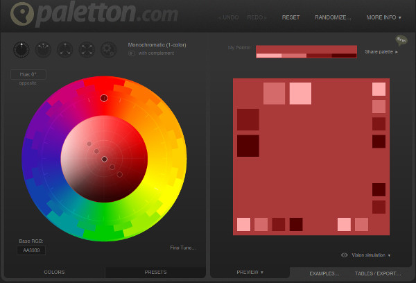
Tools like paletton.com are simply a color wheel. Paletton.com has options such as monochromatic, adjacent colors, triad, and tetrad that pick colors based on a single color selection. These are meant for web designing but can be useful for maps, as well.
Typography
Most maps have text for the title, legends, and labels. The choice of typefaces (generally referred to as fonts) for these elements can add to the overall feel of your map. It is generally recognized that different typefaces convey personalities. Some are more serious, and others are playful. For research maps, you can use a simple and formal typeface, similar to what you might choose for an article or other text publication.
The most important aspect of text on maps is its legibility. The easier to read, the better.
What typeface options are there? The main distinction is Serif versus Sans-Serif. Serif typefaces have little decorators at the tips of letters, while Sans-Serif typefaces do not. A Sans-serif typeface is good for numbers, small text on your map, and also for maps on the web. Serif typefaces can be good for printed maps, titles, and larger text. Traditionally, maps with many labels use a pair of typefaces - one serif and one sans-serif.
Sometimes you may have to take kerning (the spacing between letters) into consideration.
Try exploring combinations on TypeBrewer. Note: this site is not related to ColorBrewer.
Styling Data
So what is CSS? It stands for Cascading Style Sheets. The key part of that is ‘Style’. CSS is used to make websites look nice - the css file governs colors, sizes, and fonts.
CartoCSS has the same syntax as regular CSS. First you select the element that you will be applying styles to. For example, you could choose ‘Map’ for the entire map. Within curly brackets, you put all your properties.
One the left you put the name of the property you want to change (for example, background-color). Then comes a colon, and on the right the value for that property. You should end your lines with a semicolon.
element
  {
    propertyName: propertyValue;
  }
On the right of your new map project you can see a space with some css code already there. This is what goes in your style file when you save your project. To see the changes that you make here, remember to click ‘Save’ at the top right.
References